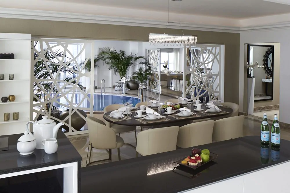
Color is a fundamental element of design, wielding the power to transform a space, evoke emotions, and create harmony. It is a language of its own, capable of conveying moods and feelings without uttering a word. In the realm of interior design, selecting the right color palette is not merely about aesthetics; it’s about crafting an environment that resonates with your personality and serves a functional purpose. Let’s navigate the intricate world of color and discover how to choose the perfect palette for your space with the help of an interior design company.
Understanding color theory:
Before embarking on your color journey, it’s essential to grasp the basics of color theory. The color wheel, comprised of primary, secondary, and tertiary colors, is your starting point. Colors have temperature (warm or cool) and intensity (vivid or muted), and understanding these aspects will guide your choices. Warm colors like reds and yellows can create coziness, while cool colors like blues and greens evoke calmness.
The role of lighting:
Lighting plays a pivotal role in how colors appear in a space. Natural light, incandescent, fluorescent, or LED lighting can alter the perception of color. Before settling on a palette, test colors under the lighting conditions of your space. The same color may look entirely different in a well-lit room versus one with minimal natural light.
Personal preferences and the mood:
Your personal preferences and the mood you want to create are paramount in color selection. Consider what emotions you want to elicit in a room. For a tranquil bedroom, soothing blues or greens may be ideal, while an energetic workspace may benefit from vibrant reds or oranges. Don’t be afraid to express your personality through color.
Cohesion and flow:
To create a harmonious space, maintain a sense of cohesion by selecting colors that work well together. This can be achieved by using complementary colors for contrast or analogous colors for a more harmonious blend. Neutral colors like white, beige, or gray can serve as a backdrop and tie different colors together.
The 60-30-10 rule:
A practical guideline in interior design is the 60-30-10 rule. This means using one color for 60% of the space (typically walls), a secondary color for 30% (furniture and textiles), and an accent color for the remaining 10% (decorative elements). This balance ensures that the room feels visually appealing without overwhelming the senses.


